
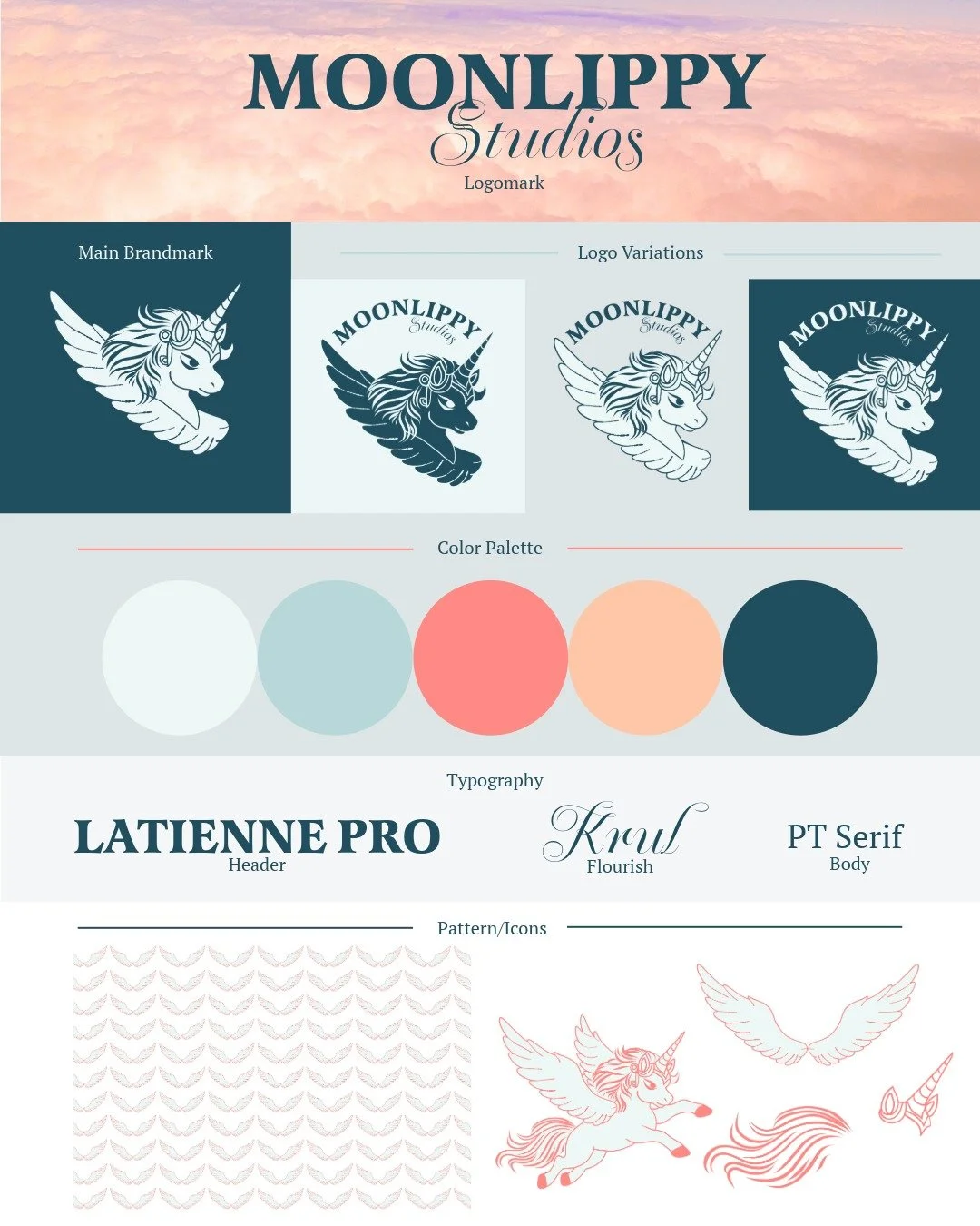
The visual direction for my studio leans fun and light, with soft, cotton-candy colors and a playful tone. It’s built around the unicorn as a recurring symbol—something whimsical, optimistic, and a little unexpected—while still feeling thoughtful and considered.
I kept the same typography for both headers and body text to keep things cohesive, but added small flourishes where it felt right. There’s always a bit of calligraphy influence in there—it’s a reference I like coming back to.
Visit the Blog for more behind the design!
Moonlippy Studios LLC